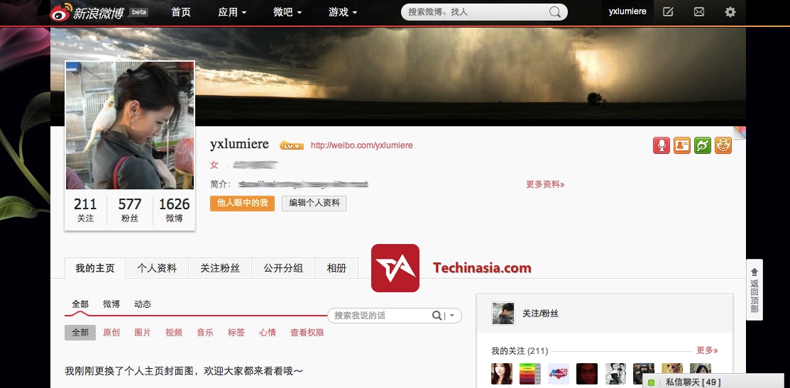
We know that the Twitter-esque Sina Weibo is testing a revamped site design which will make it look, on a user’s profile page, a lot more like a Facebook Timeline cover. And now we have our first clear and full-size look at it, thanks to reader @yxlumiere, who has access to the currently closed beta of the so-called Weibo v5 facelift.
We’re told that this beta version of Sina Weibo is pretty buggy right now, and that’s seen in some layout quirks, such as the with the three numbers misaligned beneath the profile picture. The timeline cover will be customizable, just like Facebook’s. [UPDATED: It looks fine only when widescreen, so we’ve been kindly provided with a fresh screenshot]. Click to enlarge:
The forthcoming Weibo v5 will look best, we reckon, in its regular stream view, where all but the active icon on the left sidebar is greyed out (excluding the list of synced apps that’s lower down). This is where the revamped Sina Weibo will also see the Google+ style sharing of posts with only certain groups – or circles – of friends, which is also a new feature. There’s some buggy UI in this beta page too; that blank white area is very likely reserved for a banner advert. Click to enlarge again:

My personal Weibo page (@sirsteven) is, sadly, not on this closed beta, so we’ll all have to wait for it to go public as an option to eager Weibo geeks. Stay tuned!





Stay updated on the go with our mobile app.
Get latest insights with smoother, more personalized experience through TIA mobile app.