Photo credit: Dadapixel
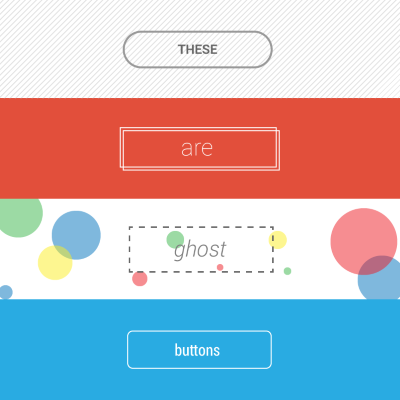
In 2014, one of the dominant design trends to pass through the UI design world has been the ghost buttons. Ghost buttons are those transparent and empty buttons that have a basic shape form, such as a rectangular or perhaps squared. They are also have titles like “empty”, “naked” or “hollow” buttons.
Ghost buttons are generally bordered by a very thin line, while the internal section consists of plain text. They most often appear as Call to Action (CTA) buttons and offer a clean look.

Normal state (left) and Focused state (right).
These buttons are often somewhat larger than traditional clickable buttons on pages and are placed in prominent locations, such as the center of the screen. Trendy and effective, when done well, they attract attention with high contrast while putting a new spin on the “flat” look.
Ghost button’s origins
The first website that mentioned the term “Ghost Buttons” came from the Tumblr blog “Websites with ghost buttons“. The origin of the Ghost Button came from the flat design revolution and ghost buttons become trendy when Apple released iOS 7. Many of the buttons on iOS’s UI are what we would call a ghost button.

‘Name’, ‘Release Data’ and ‘Featured’ are ghost-like buttons. ‘Get’ is a ghost button.
Simple and plain rectangular shape in combination with neat font inside the frame look perfectly within flat UI.
I ain’t afraid of no ghost!
Let’s now have a look at some of the positive aspects that the ghost buttons can bring to your design and user experience:
- Easy to create. Simplicity is a key reason that makes ghost-style buttons so popular. They are easy to create even for a novice designer. The most popular shape for the ghost button is a classic geometric shape (flat rectangular or oval box) with no visual decorations or animated elements.
- Create a focal point. Ghost buttons are great at keeping the eye focused on a page’s primary imagery. With properly chosen background and well-outlined contrasting border ghost button attracts attention without giving a user overwhelming impression.
- Improve aesthetics. Ghost buttons can compliment the overall clean aesthetic of the layout. They’re excellent space savers and aren’t distracting since a background image is completely viewable. The simple nature of the button allows the primary design of the page to really stand out more.
- Easy to integrate. Ghost buttons work with almost any design schema because they are transparent. They easily blend into the environment of your design.
Ghost buttons may appear alone on a page or be combined in groups. The main idea is to use a ghost button in prominent places of the page to make it noticeable for users.
Things to consider when designing ghost buttons
While ghost buttons come with a lot of design pros, there are some moments to consider as well. Before designing your app or site, make sure to weight both pros and cons to determine if this concept will work in your project.
Conclusion





Stay updated on the go with our mobile app.
Get latest insights with smoother, more personalized experience through TIA mobile app.