- Insights This article was written by a TIA community member. Insights pieces undergo the same rigorous editorial process that newsroom-produced articles have.
 Norman Teh · · 5 min read
DBS’s app misses key opportunities. Here’s my redesign
Banks.
Not many institutions can derive the same universal displeasure. But the irony is that we not only place all our savings in them but also monitor our investments, bank balances, and transaction history on their platforms.
The reality is we rely on them more than we profess.
In 2010, I relocated to Singapore for work. A couple of months later, I opened my first account with DBS. The experience was seamless, easy, but not memorable . This sums up most of our experiences with our financial institutions.
Since then, the financial industry has gone through exponential advancement. In early 2015, it exploded with fintech startups and VCs disrupting traditional services and questioning the role of banks in our daily lives.
DBS in the interim has come a long way too.
Reports in 2009 showed that they had the lowest customer satisfaction score of any bank in Singapore. But eight years on, they’ve transformed into a regional financial powerhouse by winning Euromoney’s “World’s Best Digital Bank Award,” launching India’s first mobile-only bank, acquiring ANZ’s wealth management and retail banking business, and developing multiple banking apps.
I’ve been using DBS’s Digibank app for some time now, and though it offers the basic needs, it doesn’t do much else. That’s disappointing, as there is so much missed opportunities.
I’m aware that banks face a great wall of compliance and regulatory issues when handling data, but I’ve noticed a few gaps in DBS’s app user experience that could be improved while still working within these constraints (hopefully).
Here are three UX/CX recommendations for DBS’s Digibank app.
1. Deconstructing the sign-in experience
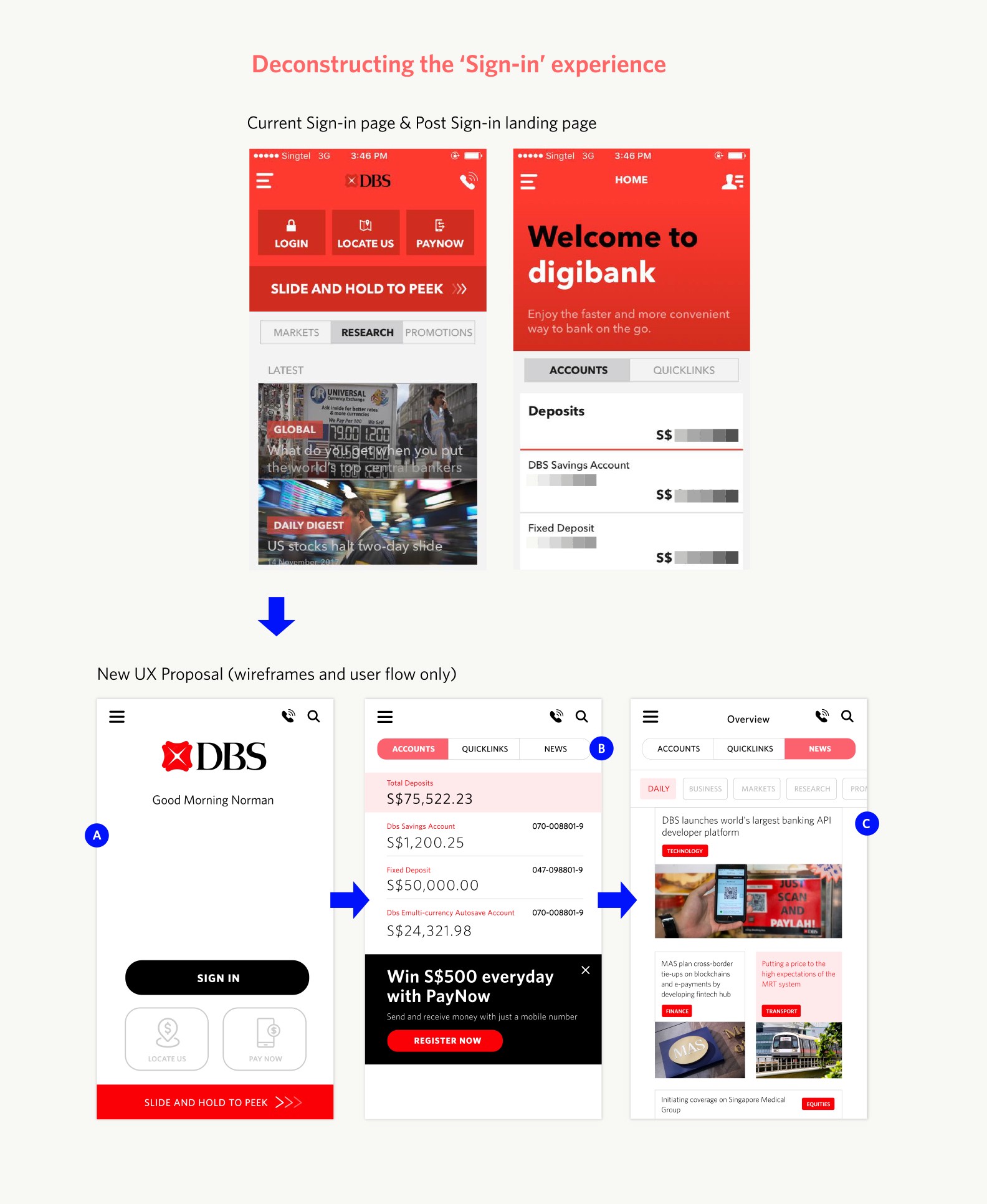
(A) First, when a customer opens the app, they’re taken to a pre sign-in page where they are greeted with a barrage of information.
How can the DBS team simplify this experience to put their customer needs first?
They need to start by stripping away the noise by re-organizing the information architecture to focus on greeting customers first and serving their fundamental needs (sign in, locate us, pay now, or slide and see total deposit amounts).
2. Smarter search capability
3. Making transaction history proactive and purposeful





Stay updated on the go with our mobile app.
Get latest insights with smoother, more personalized experience through TIA mobile app.