- Insights This article was written by a TIA community member. Insights pieces undergo the same rigorous editorial process that newsroom-produced articles have.
 Yoonjeong Lee (Shannen) · · 11 min read
A case study of Carousell’s UX design
Yoonjeong (Shannen) is a TIA Star Contributor and publishes high-value content that serves the Asian tech community. Read more from TIA Star Contributors here.
Disclosure: The author of this post is not affiliated with Carousell.
I have decided to become a minimalist. So, I gave many of my stuff away to my friends, but some expensive and new stuff I couldn’t just give away. Why not sell them at a reasonable price? This was why I installed Carousell on my iPhone. And yes, I couldn’t just sit down and use the app as it is.
But I do highly value the app’s concept: it adds some 💵 to my bank account, I can get stuff at cheaper prices, and it helps us preserve the environment at some points.
Where I was struggling
Using Carousell for the first time, I was confused. As a UI designer (who wants to become a UX designer), I wanted to improve its UX. I chose these two flows:
- Onboarding and sign up
- Listing and editing a product as a seller
Here was my internal dialogue (please don’t laugh):
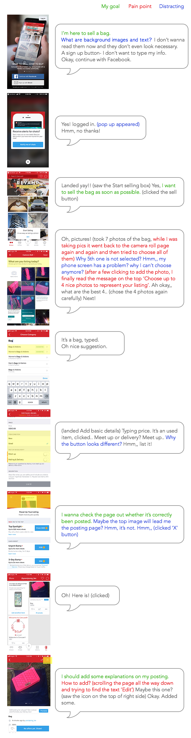
Done! Took me four minutes. Now, I’m selling a bag.
My redesign objectives
- Eliminate the confusing moments and solve pain points
- Attract users in a clean manner at first glance
- Prompt action
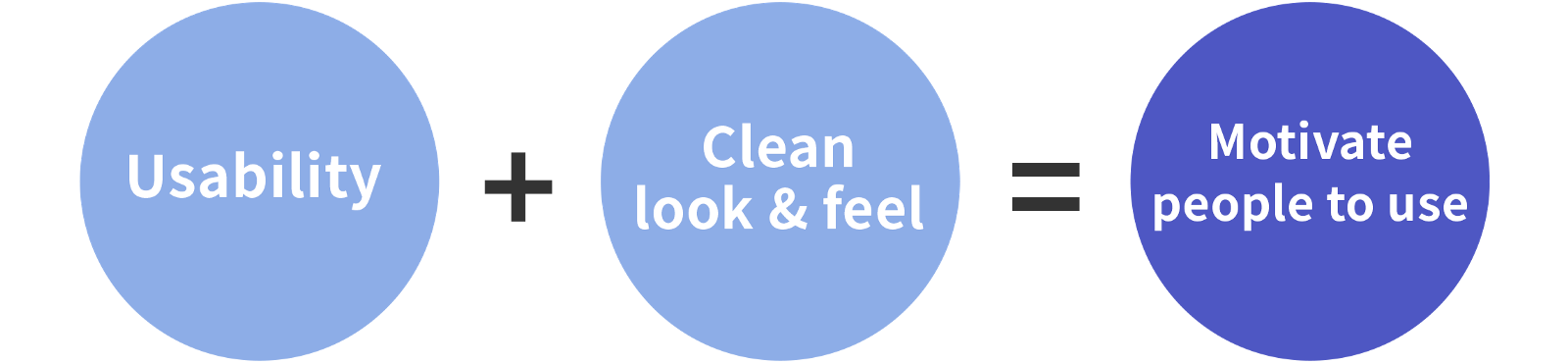
My design process





Stay updated on the go with our mobile app.
Get latest insights with smoother, more personalized experience through TIA mobile app.