Rick Martin · · 2 min read
Institute for Information Design Japan Visualizes Radiation in Google Earth
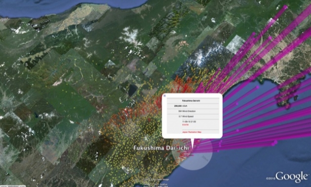
Fukushima Dai-ichi radiation visualized in Google Earth
I’ve talked a lot about the importance of data in the wake of Japan’s Fukushima nuclear disaster. The radiation threat was and still is very difficult to measure, and in the absence of adequate information, people get scared. And that has very real effects – on the economy, on tourism, on peoples’ state of mind. Among those many volunteers who worked towards helping the public understand the radiation numbers back in March was The Institute for Information Design Japan.
We received word from the Institute today that its radiation map is now providing live radiation updates at over 400 locations. And while the radiation map is nothing new (you can find many others online), a representative points out that the Google Earth visualization “creates a compelling immersive view on the scale of differences of radiation levels which could not be conveyed by flat map representations alone.”
Some of you may recall that Pachube had a similar visualization that was equally stunning.
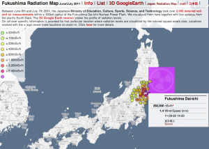
Unfortunately I’m told that the Fukushima Dai-ichi and Onagawa datasets are difficult because TEPCO is providing the data in PDF and JPG file formats. So while other data published in accessible, machine-readable formats can automatically update the map, this is not the case for the most critical data near the power plant. To me, this seems pretty disgraceful on TEPCO’s part, since organizations like the IIDJ are compensating for their shortcomings in making the data clear and understandable for the public.
The Institute explains its motivations:
We do hope that these interactive visualizations of very dense data-sets encourage decision-makers to further pursue detailed monitoring of radiation levels and to provide the results to the public in a comprehensive form. As this is an issue of concern also to the international community, we expect that the sharing of these information will help inspire all concerned people in their further understanding and planning.
It’s great to see volunteers like this stepping up and helping the public understand what’s going on. It would be nice if they received a little more support from TEPCO who is still not providing critical data in machine-readable, open formats six months after the accident. We reached out to a TEPCO representative this morning asking about this, but have not received any reply yet.
To view the radiation maps and visualizations, visit the links below:
- General Map: jciv.iidj.net/map | Google Earth: jciv.iidj.net/map/kml
- Fukushima Map: jciv.iidj.net/map/fukushima | Google Earth: jciv.iidj.net/map/fukushima/kml





Stay updated on the go with our mobile app.
Get latest insights with smoother, more personalized experience through TIA mobile app.