 Winston Zhang · · 5 min read
Storytellers’ Studio: Behind the scenes with TIA’s creative team
Over the last few months, we’ve been publishing profiles featuring folks from the Tech in Asia Studios team. From understanding the big picture with the head of Studios to catching up with 10-year veterans and diving deep into the mind of a creative, we wanted you to get to know the people behind the content you consume and the events you attend.
We’ll continue with the profiles, but we decided to add another layer to this exercise. While we’ve also published case studies that put the spotlight on how our events serve the community – attendees, speakers, and sponsors alike – we haven’t done the same for our partnership content and design capabilities.
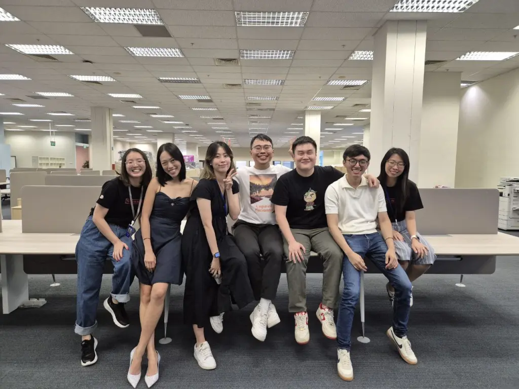
The people behind said partnership content and design capabilities. For the purposes of today’s article, Stefanie’s on the left, while Jonathan and Susi are on the right. / Photo credit: Tech in Asia
In a new series of articles, you’ll not only see the work our creative team puts out, but also hear from the writers and designers themselves. This way, you’ll get to understand exactly how we transform client briefs and big-picture ideas into content that not only meets business objectives but also stand as thought-provoking articles and engaging designs in their own right.
Let’s get started.
1. Relating to the reader
Articles that recap panel discussions are about as dry as content gets. By default, the key insights wouldn’t be fresh since they have been shared on stage. Additionally, words on a page are always going to pale in comparison to watching the session live or, barring that, a video of the discussion.
For instance, Studios writer Stefanie Yeo received a brief from Amazon Web Services (AWS) to recap a panel discussion that the cloud computing company had participated in with Indonesian firm IDN Media. To meet the goal of building brand awareness and position AWS as a partner to startups, she decided to borrow a little pop magic and take a more personal angle.
Stefanie opened the article with a video clip of K-pop idol Eunkwang committing an English gaffe while livestreaming. Doing so was not only a fun way to open the conversation, but it also made the story relatable to readers. Maybe not everyone knows about the technical ins and outs of livestreaming, but they can certainly appreciate a celebrity sharing a light-hearted moment with fans.
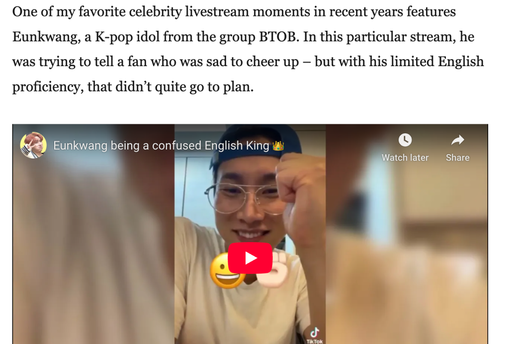
An engaging opening. / Photo credit: Tech in Asia
“Instead of just reporting what was discussed, I drew connections between what the panelists said and my own experiences with livestreaming. Then I tied what the experts shared on stage to what an average consumer such as myself would experience,” she explains.
Establishing a foundation that invites experts and laypersons alike into the discussion enhances the brand awareness aspect of the article. It sets a solid stage for connecting and understanding.
“Sharing this specific anecdote, which had gone viral online, felt like the right fit,” Stefanie says.
2. Behind the visuals
“Show, don’t tell” is a common piece of advice in storytelling, but it’s really the only option when it comes to design work.
In putting together the design elements and key visuals that would characterize Tech in Asia’s inaugural Saigon Summit in 2024, design lead Susi Susanti turned to the streets of Ho Chi Minh City (HCMC).
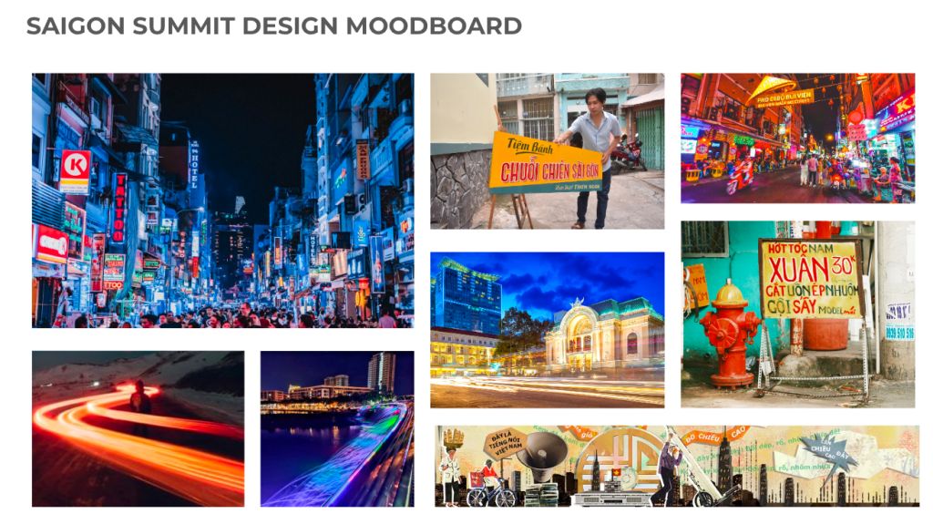
It was a matter of synthesizing all of this into an eye-catching and meaningful design and style. / Photo credit: Susi Susanti
“I was really inspired by the light trails and streetlights of HCMC – the way they paint the city with energy and movement at night,” she explains. “I wanted to capture that same atmosphere in this event’s design: bold, colorful, and full of life, yet still warm and inviting.”
The colors of Susi’s design were drawn from the city’s street signs and daily visuals, while the font was derived from vintage Vietnamese typography. Ultimately, the overall design lives and breathes HCMC, blending the nostalgia of its past with the pulse of its modern cityscape.
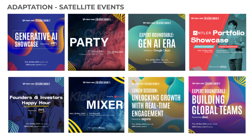
How the core design works across different contexts and to promote different segments of the Summit. You can see the full design of the microsite here. / Photo credit: Susi Susanti
“Since this was our first-ever conference in Vietnam, it was important to create something bold and unmistakable – something that immediately grabs attention and builds strong awareness,” she notes.
3. Bringing the mundane to life
Insurance is seen as a necessary evil by most people. Many of us are lucky enough to not need to make any major claims, so we just grumble a bit when it’s time to pay our premiums and then forget about it for the rest of the year.
Still, no one can deny the importance of insurance. When Prudential approached us to highlight how it has digitalized its products to improve efficiency and the user experience, Studios writer Jonathan Chew and graphic designer Lim Chae Huah did so by creatively depicting the typical user journey of a policyholder, adding flair to an everyday necessity.
The result? An interactive narrative experience, complete with illustrations.
Don’t forget to click on the interactive elements in the infographic! / Infographic credit: Lim Chae Huah and Jonathan Chew
“The brief requested covering a few aspects like AI analytics and digitalizing some of the onboarding process,” Jonathan explains. “For us, the creative goal was to tie these back to a personal experience.”
This involved developing a character that people could identify with, adding details like his hobbies and lifestyle preferences to flesh him out. The team wanted readers to think, “Oh, that applies to me too” and understand how Prudential’s advancements could benefit them.
The illustrations and interactive slideshow weren’t just flashy add-ons. The visuals amplify the “storybook” feel of the narrative, while the interactivity brings readers – quite literally – into the story. Doing so also helped make drier, administrative information easier for readers to digest.
“Ultimately, this made for immersive and interesting reading. After all, who doesn’t like looking at nice, creative artwork?” Jonathan says.
We value your feedback!
We’d like to get to know you too! Your thoughts and opinions on these articles are essential in helping us improve our content and how we meet your expectations.
Please answer a few quick questions below about your experience with this article – it will take no more than two minutes to complete. Thank you for helping us grow and serve you better!
Stay updated on the go with our mobile app.
Get latest insights with smoother, more personalized experience through TIA mobile app.
Recommended reads
 The recipe for viral AI apps
 Stripe design chief warns AI creates a hidden pull to mediocrity
 Indonesian startup makes TikTok-ready content from a single prompt
 AI to cart away ecommerce shoppers?
 Product management in the AI era
 A milk tea a day keeps troubles at bay
 Asia’s AI video gold rush
 Could the future of tech be found in an art museum?
 Discomfort is the real growth hack
 OpenAI’s Codex head sees “incredible” adoption across Asia





Editing by Eileen C. Ang
(And yes, we’re serious about ethics and transparency. More information here.)





📅 Upcoming Events
22 October 2026
Payoneer x CSPN Summit 2026