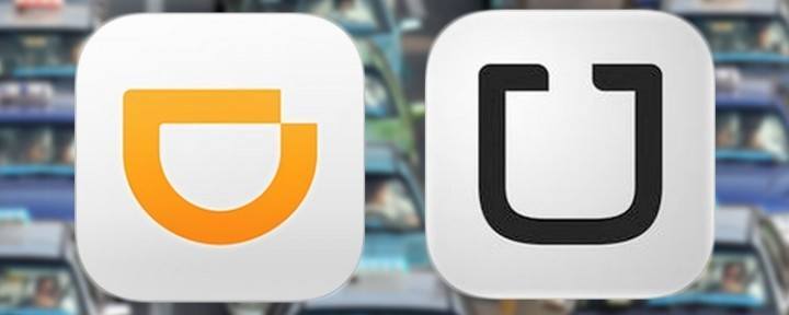
What do you do when you’ve got China’s domestic car-hailing market locked down, you’re raking in billions of dollars, and you’re dubbed one of China’s most exciting new companies? You… make a logo that resembles your main competitor’s.
How did this even happen? There is no way that Didi Kuaidi’s recently unveiled new logo made it through the production process without at least one person saying, “Hey, that sure looks a hell of a lot like Uber’s.”
According to a Didi spokesperson who spoke to the Wall Street Journal, “The D is turned sideways to represent a smile.”

Previous logos of Kuaidi Dache and Didi Dache
To make matters worse, the folks at Hong Kong’s Oriental Daily note that Didi’s icon bares quite a strong resemblance (i.e. they’re exactly the same) to the logo of Dentech, a dental care center located in Mumbai.
A Didi public relations director quoted by Oriental Daily said the logo was designed over the course of six months, and that the final icon was carefully selected from a pool of more than 200 entries. He added that the company did not copy Uber.
Editing by Terence Lee
(And yes, we’re serious about ethics and transparency. More information here.)





Stay updated on the go with our mobile app.
Get latest insights with smoother, more personalized experience through TIA mobile app.