Terence Lee · · 3 min read
Uber has a new icon. People hate it. Here’s why it doesn’t matter.
It’s a familiar story. Hip tech company rebrands. Twitter goes amok with people hating on the new logo. “Experts” weigh in. Life goes on.
The latest sequel to this familiar story involves Uber. I first saw the new app icon in Wired’s puff piece about the “radical rebranding.”
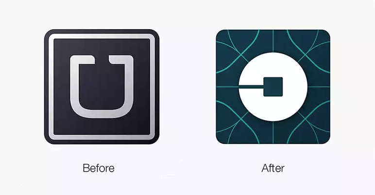
I’ll admit: I thought it was ugly. So did many others. It’s a drastic departure from the old icon. It’s confusing, resembling an “O” rather than a “U.” The background design with the lines looks dated and amateurish.
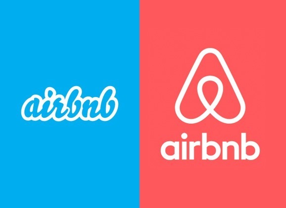
But I’ll probably get over it soon. Just like how people got over Airbnb’s rebranding.
Remember the hilarious memes? About how it resembles a vagina? Here’s a refresher:
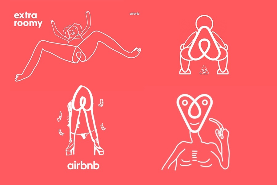
Disastrous, right? Not really. The more people got exposed to it, the more they were okay with it. They moved on. Airbnb’s business didn’t collapse overnight.
And I bet it’ll be the same with Uber. This storm will blow over. A big misconception: the “logo” that people are fussing about isn’t Uber’s actual logo. It’s an app icon.
Uber’s actual new logo hasn’t changed much. It’s actually more readable:





Stay updated on the go with our mobile app.
Get latest insights with smoother, more personalized experience through TIA mobile app.