Image Credit: Behance
Designers know that design is more than good looks. Design also covers how users engage with a product, whether it’s a website or app. It’s like a conversation. Navigation is a conversation. Because it doesn’t matter how good your site or app is if users can’t find their way around it.
Why is bottom navigation so important?
Steven Hoober in his research of mobile devices usage, found that 49% of people rely on a one thumb to get things done on their phones. In figure below, the diagram that appears on the mobile phones’ screens are approximate reach charts, in which the colors indicate what areas a user can reach with the thumb to interact with the screen. Green indicates the area a user can reach easily; yellow, an area that requires a stretch; and red, an area that requires users to shift the way in which they’re holding a device.
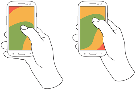
Image credit: uxmatters
It’s important to place top-level and frequently-used actions at the bottom of the screen, because they are comfortably reached with one-handed or one-thumb interactions.
Tab bar
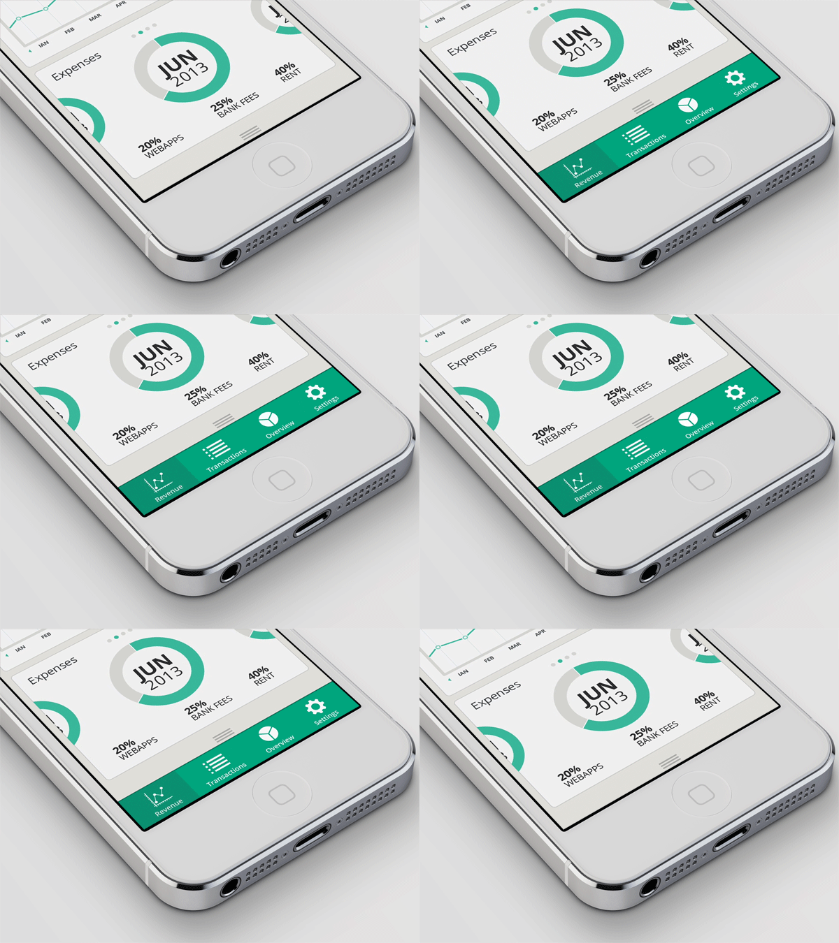
Many apps follow this rule and use the bottom navigation (a.k.a. tab bar) for the most important app’s features. Facebook makes main pieces of core functionality available with one tap, allows rapid switching between features.

Facebook bottom tab bar for iOS.
3 crucial moments for bottom navigation design
Navigation is generally the vehicle that takes users where they want to go. And bottom navigation should be used for the top-level destinations of similar importance. These destinations requiring direct access from anywhere in the app.
Good bottom navigation design follows these three rules.
1. Show only the most important destinations
Use three to five top-level destinations in bottom navigation. If there are fewer than three destinations, consider using tabs instead.
2. Communicate the current location
3. Make navigation self-evident
Takeaways
Conclusion





Stay updated on the go with our mobile app.
Get latest insights with smoother, more personalized experience through TIA mobile app.