- Insights This article was written by a TIA community member. Insights pieces undergo the same rigorous editorial process that newsroom-produced articles have.
 Peng Lin Ang · · 9 min read
Users are unhappy with Ryde’s app, so we redesigned it
Photo credit: Ryde
In Singapore, more than 1 million private-hire vehicle (PHV) trips are made daily. This year, homegrown carpooling service Ryde launched RydeX, their first PHV service, and uses a mobile app similar to Grab or Uber.
However, it appears that many users have many unpleasant experiences with the app. Reviews in the Apple and Google app stores suggested that the app failed to provide system feedback, such as notifying users when a ride has been successfully processed or sending verification SMSes during registration. There were mentions of “unfriendly UI” as well.
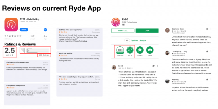
The app scored an average of 2.6 stars on both platforms.
User interviews
To gain more insight, we conducted six face-to-face interviews, five remote interviews, and an open-ended survey with 17 participants using Optimal Workshop.
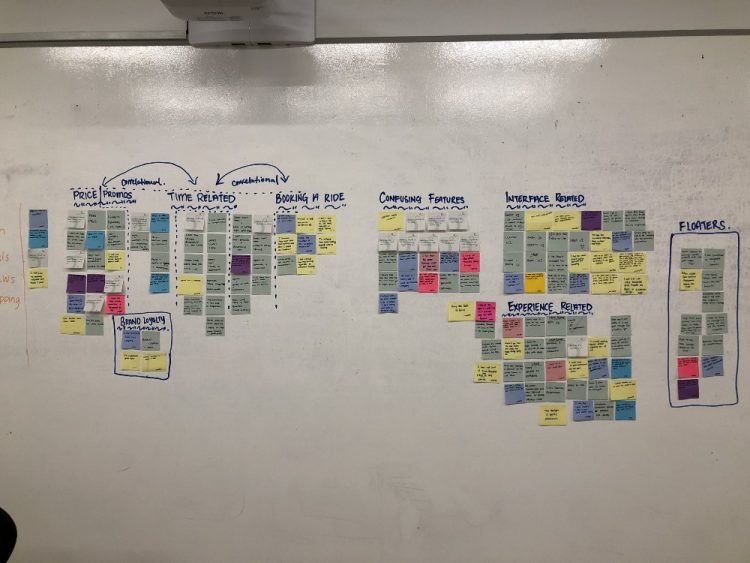
We spent the entire afternoon working on our affinity map.
Key takeaways:
Decision paralysis: There were many app options on the landing screen, such as insurance/game features, which do not help users book a car. Interestingly, Ryde reflects competitor prices when users type in their destination. “Why direct your revenue to competitors?” commented an interviewee.
Language: From our research, users do not understand terminologies like per trip/per pax when booking a Rydepool. We suspect that the per-trip feature is meant for users taking a Rydepool but would like to be dropped off first, hence the difference in price.
Recognition over recall: Users navigate better by picking up similar UI patterns/actions across apps that provide similar services, ensuring a gentler learning curve. From there, we will leverage on Ryde’s USPs to outperform competitors.
System feedback: Many users have reported that there is no feedback on whether a booking has gone through or not.
Help: In the current app, users are left to their own devices with no onboarding, leading them to spend considerable time trying to recover from errors.
Personas
Problem statement and hypothesis
User journeys
Storyboard
Feature prioritization
Wireframing
Usability testing round one
Hi-fi prototyping
Before and after
Usability testing round two
Next steps





Stay updated on the go with our mobile app.
Get latest insights with smoother, more personalized experience through TIA mobile app.