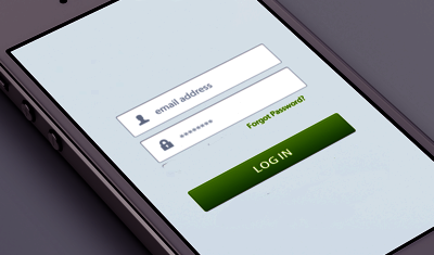
While sign-in walls (demanding that users must register or log in before they can fully access an app or site) generally isn’t a very good practice, they are still very common in our digital life. You most likely go through a login process pretty much every day. Even though they are so common, they also are one of the trickiest parts of design. The designer’s job is to figure out which elements they should include or exclude to create great user experience.
Make sure that your login page isn’t an obstacle to your users by following these tips for designing a better login process.
Show input text fields
If logging in is a required action for work with a site or an app, then it should very much be the primary feature of the page. Users should’t take any extra steps to figure out how to log in. For example, Mint requires users to log in before using the service, but the login form is hidden behind controls.

Mint for desktop
When registered users come to a site or launch an app, it should be immediately clear where they can log in. Twitter shows login input fields straight on the main page of service, and this makes it clear for users where they can log in.
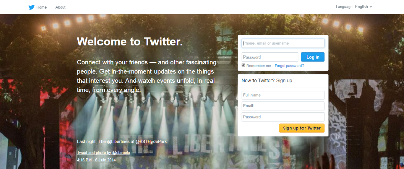
Twitter for desktop
Takeaway: Rather than providing a ‘Login’ or ‘Sign in’ buttons, it’s better to show the input fields, so users can log in immediately.
Don’t use ‘Sign in’ and ‘Sign up’ together
How fast can you spot the difference between ‘sign up’ and ‘sign in’ on image below?

Bad: ‘Sign in’ and ‘Sign up’ looks
‘Sign in’ and ‘Sign up’ look quite similar.
Differentiate login from registration
Allow users to log in via Facebook, Twitter or Google+
Let users see their passwords
Use an email address or phone number as login data
Keep users signed in when they register
Warn users when the caps lock is on (desktops only)
Auto-focus the first input field (desktops only)
Conclusion





Stay updated on the go with our mobile app.
Get latest insights with smoother, more personalized experience through TIA mobile app.