Ben Jarris · · 7 min read
This creative director shares 7 UI and UX tips for non-designer founders
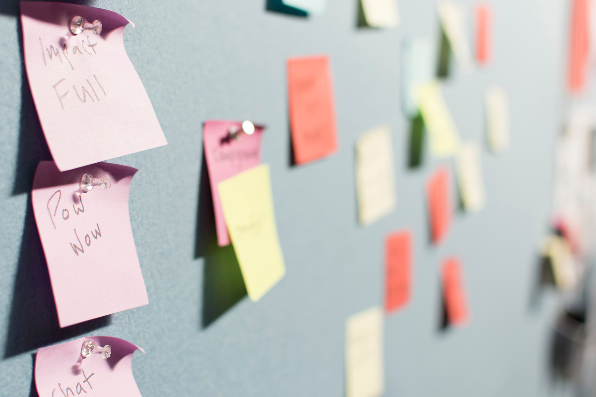
Photo credit: Patrick Perkins.
Software development acronyms can be confusing and, quite frankly, a little over the top. It’s rare to have a conversation without someone mentioning MVP, CPC, PMF, ARPU, CTR, IAP, and WAP these days.
Look up any that inspire head-scratching, but let’s focus on two of the most important design acronyms for entrepreneurs and digital product creators: UX and UI.
“Yeah, yeah. I know what those mean,” you might be thinking. But do you really?
Humor me for a moment:
- UX stands for user experience. It’s all about maximizing how people flow through an app or site, structuring information properly, and ensuring that users like to open and interact with your product. A positive UX eliminates friction and confusion and makes the app enjoyable to use.
- UI stands for user interface. This is the look and feel of everything from images to buttons to graphics and text. The right interface makes your product look professional. It builds trust and confidence, ensures you attract the right customers, and immediately distinguishes your app in the market.
Building from the bottom up
My kids think I draw pictures and play games all day in the office at Appster (they’re not entirely wrong), but I tell them that my job is like building a house.
- The UX is the blueprint. It maps the technical structure and outlines how you move from the kitchen to the bathroom.
- The UI is all the pretty, sensory stuff inside. It’s the furniture, the paint colors, the fluffy pillows, and the soft rugs.
So, I plan things out—where to put the plumbing, electricity, and structural beams—but I also make sure the app looks great and is ready for house guests.
We’re all digital product users, so we know firsthand that both UX and UI are essential even if you’ve never thought about why an app feels simple and compelling.
If we put them in a Mad Max-style cage match, though, UI would always emerge victoriously. For apps and digital products, almost nothing matters more than UI.
The power of trust
As of May 2017, according to Statista, there were 2.2 million iOS apps in the App Store. With that kind of volume, how on earth do you choose?
People want to download something that feels trustworthy and, if it looks good, they’ll forgive you for almost everything else.
Since the caveman days, humans have also been adept at making snap visual judgments. Should I eat that spiky plant or chase that wooly mammoth? We are built to take in huge amounts of information and decide in a fraction of a second. Today’s app users have incredibly sophisticated tastes and visual sensitivities. Underestimate them at your peril because if you don’t look pro, you’ve already lost the game.
Emotional drivers and ease of use
A final thought and some homework





Stay updated on the go with our mobile app.
Get latest insights with smoother, more personalized experience through TIA mobile app.