- Insights This article was written by a TIA community member. Insights pieces undergo the same rigorous editorial process that newsroom-produced articles have.
 Chloe Zou · · 3 min read
2 important UI design and evaluation principles you should always test
Photo credit: Pixabay.
The focuses of graphic user interface design and evaluation are exactness, ease of use, and visual effects.
An interface, similar to a human face, has a direct advantage in attracting users. A well-designed interface can guide and lead users to complete an operation. And rationally designed interfaces can give users a sense of accomplishment.
As a tester, you should test whether the style of a user interface can meet users’ needs and follows some UI design and evaluation principles (e.g. whether an interface is beautiful and visualized and whether the operation is user-friendly and easy).
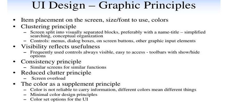
Without a fixed rule on what an interface should be, it depends on the tester’s subjective judgment especially for usability and visual effect evaluation. Therefore, personal viewpoints should be better taken into consideration.
One thing to note is that there are some basic principles in user interface design that need to be tested.
There are various kinds of currently prevalent UI styles: the style of the browser used by B/S-structured software, single-window and multi-window, and the style of resource manager, among others. No matter what kind of style it is, great importance should be attached to the following user interface design and evaluation principles.
1. Ease of use
This user interface design and evaluation principle suggests that the names of buttons and menu items on the screen should be easy to be understand. Make sure that the right words are used; avoid confusing and misleading terms. Words should easily make a distinction between the buttons and menu items in the same interface. It’s even better if users can understand the functions of the interface and make correct operations relevantly without referring to the FAQs.
Here are some details of this principle:
- Buttons with the same or similar functions should be framed; shortcuts should be supported by commonly used buttons.
- Elements with the same functions or tasks should be placed on a centralized location so as to shorten the distance of icon movements.
- The interface should be divided into several zones based on functions; zones should be framed and have functional specifications or titles.
- The interface should support the auto-switching function of the Tab button.
- Significant components and information that should be input first on the interface should be located at the front place of Tab order and the full position of the window.
2. Visual effects





Stay updated on the go with our mobile app.
Get latest insights with smoother, more personalized experience through TIA mobile app.












📅 Upcoming Events
22 October 2026
Payoneer x CSPN Summit 2026