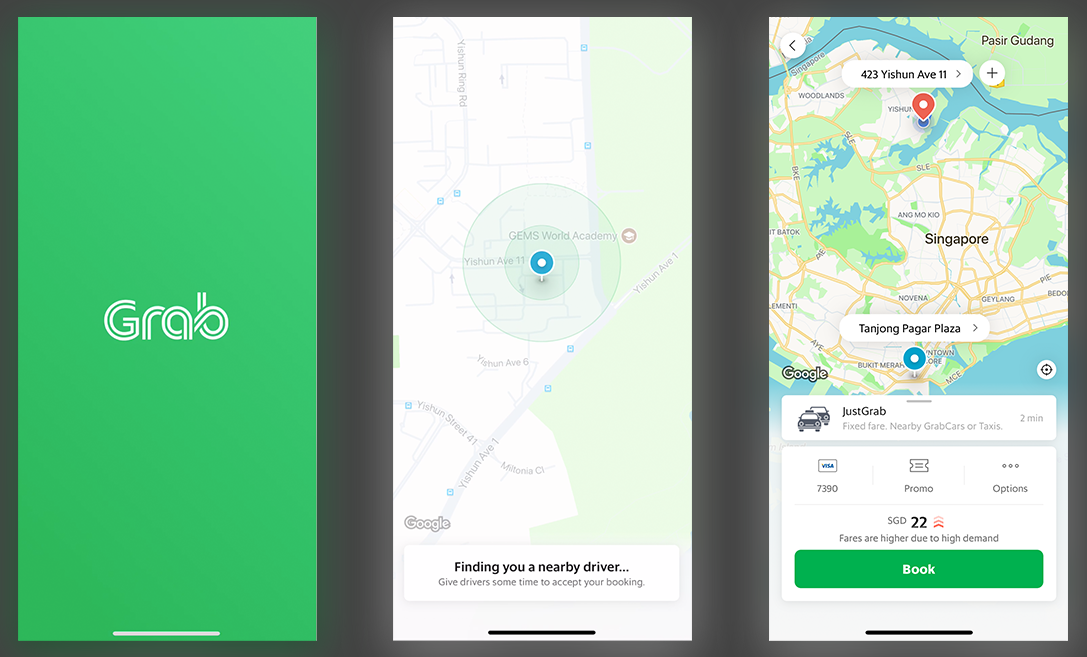
Grab’s acquisition of Uber’s Southeast Asian operations makes it the clear ride-hailing leader in many Southeast Asian countries.
Whether this is good for users and riders is still an open question. A scan of Grab’s Facebook page, however, reveals a myriad of complaints about its services. Is this inevitable given Grab’s size? Or is this abnormal?
As a designer myself, I’ll analyze Grab’s app from a product perspective to shed light on the issue.
By looking at the good and bad design decisions in Grab’s product, we can also get a glimpse of what it’s like for Grab to be the dominant player. The downsides of Grab’s app design (some of which are deliberate) can have serious implications in the absence of strong competitors.
The good: Context-aware design
Let’s start with one bright spot. Grab has a great context-aware design, which means it displays the right kind of information at the right time.
For instance, when your driver is arriving, the app enlarges your driver’s license plate number and renders it in a font that resembles a car’s number plate:
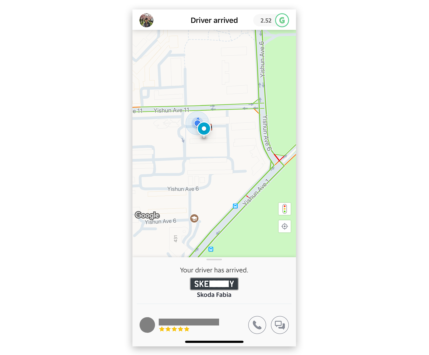
This neat design makes it easier for riders to spot their drivers.
The bad: Unpolished aesthetics
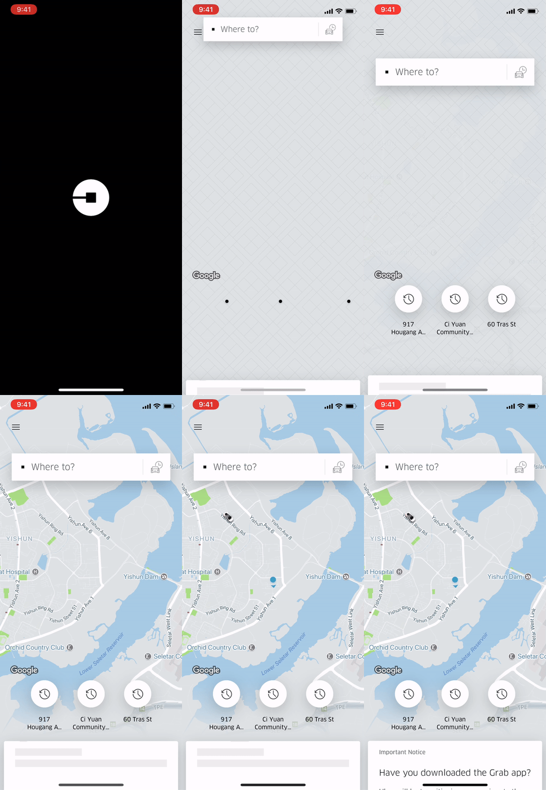
From an aesthetics standpoint, Grab’s app experience may be inferior to Uber. Uber’s focus on sleek animations and eye-catching graphics have created a smooth ride-hailing experience.
Just look at Uber’s polished loading animation, which is distilled directly from the dreams of designers:
The bad: Difficulty in getting a ride
The bad: Lack of transparency about surge pricing
Putting it all together





Stay updated on the go with our mobile app.
Get latest insights with smoother, more personalized experience through TIA mobile app.








📅 Upcoming Events
22 October 2026
Payoneer x CSPN Summit 2026