There have been a number of visualizations related to last year’s March 11 earthquake in Japan. But this just might be the most insightful one that I’ve come across to date. Created by YouTube user StoryMonoroch, the visualization shows all the earthquakes in 2011 represented as circles, with the size of the circle representing the magnitude of the earthquake.
But what’s most remarkable here is that the designer(s) went one step further in conveying earthquake magnitude [1], and added sound as well – so bigger quakes are represented by louder blips. So if you play the visualization starting from January first, and let it play until March, the quakes occur (more or less) with regularity. And then March 11 hits (skip ahead to view here), at which point the blips go absolutely crazy. Check out the full video below.
Near the end of the video, there are also charts to show a timeline of earthquake frequency, for magnitude 5 and above and for magnitude 3 and up. The latter is more interesting to me (see picture below), speaking as someone who lives in Tokyo – because really it’s hard to remember how frequent earthquakes were before March 11. I know that things were still pretty shaky for the rest of that month, with big quakes occurring on a regular basis. But this graph gives a good comparison of the situation before the quake, and how things were late in the year – and these are two periods that my memory has difficulty comparing.
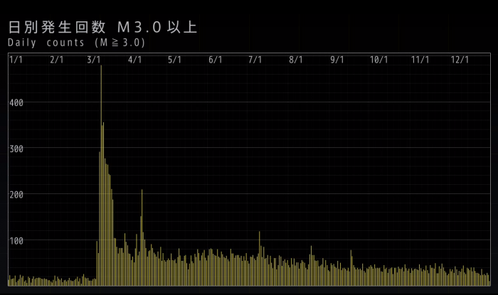
The creator, StoryMonoroch, prefaces that this visualization is only a personal work and not is “unofficial.” It would be wonderful to see stuff like this comes from media in Japan as opposed to volunteers. Whoever created this visualization (no contact info is provided) is serving the civic good on his/her/their own time. And considering the amount of work that must have went into this, that’s a pretty cool thing to do.
[Via Wired]
-
Data used is from the Japan Meteorological Agency. ↩





Stay updated on the go with our mobile app.
Get latest insights with smoother, more personalized experience through TIA mobile app.









📅 Upcoming Events
22 October 2026
Payoneer x CSPN Summit 2026