- Insights This article was written by a TIA community member. Insights pieces undergo the same rigorous editorial process that newsroom-produced articles have.
 Lara PuReum Yim · · 7 min read
How we built a widget at Grab to help users predict fare surges
This article was co-authored by Ajmal Afif, Calvin Ng Tjioe, Prashant Kumar, Preeti Kotamarthi, Raghav Garg, and Renrong Weng.
Transport demand can be rather lumpy. A lot of passengers tend to request for cars around the same time due to organic patterns like office hours. In cases like this, the surge in demand could outpace driver supply, thereby increasing passengers’ waiting time.
Since our goal at Grab is to make sure people get a ride at the time and price they want, we thought about how we can ease the friction. We then looked at leveraging big data to help passengers plan their trips better.
Peak shifting
Looking at the data, we noticed that there is a seasonality to demand and supply. At certain times and days, imbalances appear, peak, and disappear. And then the process repeats.
Studies say that humans in general are creatures of habit prone to inertia, unless they have a compelling reason or benefit to change. So we set out to achieve that by making a widget, one that would allow us to give passengers information that can help them decide when to book a ride, effectually redistributing the demand to non-peak periods. This is called peak shifting.
Although this may be the first time peak shifting is applied to the ride-hailing industry, the term was actually introduced long ago.
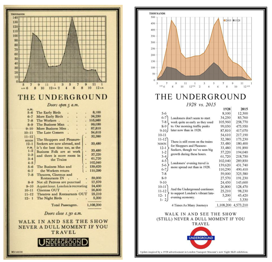
Photo credit: London Transport Museum
For example, London Underground, the UK capital’s public transit system, tried peak shifting long before anyone else. The photo above on the left is the system’s original ad from 1928, while the one on the right is from 2015, comparing how people traveled then and now.
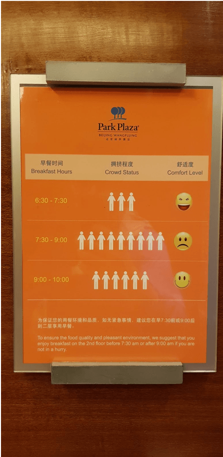
Prashant Kumar, Grab’s product manager, saw this poster while on holiday.
Hotels are also adopting the concept. Notice the poster above in an elevator at a Beijing hotel, announcing the best times to eat breakfast in comfort to avoid the crowd.
How the travel trends widget works
Digging into our data was way more complex than we thought, as market conditions could vary from day to day. This meant that generic statements like “5:00 pm to 8:00 pm are peak hours and prices will be high” would not hold true. Contrary to general perception, we observed that even during peak hours, there were periods when surge was low or there was no surge at all.
For instance, plot one and two below show how surges look like on a typical Monday and Tuesday, respectively, in a given month. One of the key insights is that surge trends during peak hours on Monday were different from that of Tuesday. It reinforced our initial hypothesis that market conditions are unique from day to day.
How we built it
Applying multiple disciplines
User feedback and data-driven insights





Stay updated on the go with our mobile app.
Get latest insights with smoother, more personalized experience through TIA mobile app.