- Insights This article was written by a TIA community member. Insights pieces undergo the same rigorous editorial process that newsroom-produced articles have.
 Yu Siang Teo · · 12 min read
Singapore’s new train displays have serious design issues. Here’s what we can learn
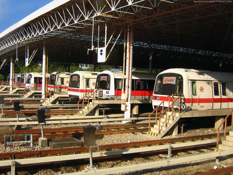
Photo credit: Calvin Teo.
In April 2017, one of Singapore’s train operators, SMRT Corporation, started rolling out a brand-new fleet of trains. These shiny new trains have LCD displays inside them—displays that will dynamically update their content to help commuters find their way around the train network.
Sounds like a great idea, doesn’t it? But the actual execution of the display was so bad it makes for a perfect case study of how bad design can destroy a great idea. So, buckle up and get ready for a ride (sorry) that is equal parts entertaining, exasperating, and educational.
Staris 1.0: The original design
Before the new LCD displays, SMRT trains used the SMRT Active Route Map Information System or STARiS. Since I don’t approve of the quirky capitalization used, I’ll refer to it as Staris instead.
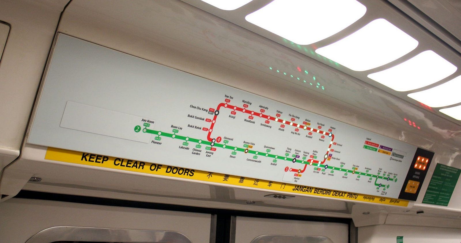
Staris 1.0
Staris displays the train route map (well, it’s technically a diagram, not a map—more about that below) of the North-South and East-West train lines. Green LED lights indicate the rest of the journey, and a blinking red light tells you the next stop. Pretty straightforward and elegant.
A major drawback of the original Staris is that, being a physical display, it needs to be changed every time new stations or train lines are added to the network. Unfortunately, that happens regularly enough to be a real pain. (On the photo above, notice the sticker near the left edge of the display, which covers a future line extension.)
SMRT needed a new display—a digital one—so that the train map can be dynamically updated whenever new stations are added.
Staris 2.0: Oh, no. They did not
Staris 2.0, an all-digital iteration of the previous display, makes perfect sense if it weren’t so horribly designed.
Because the problems with Staris 2 are so numerous, and because there’s so much we can learn from bad design, I’ll break down the new display, one bad design decision at a time.
1. It’s ugly. Oh, it’s really ugly.
The first thing you’ll notice about the new Staris is its horrible visual design.
Now what?





Stay updated on the go with our mobile app.
Get latest insights with smoother, more personalized experience through TIA mobile app.