This article was co-authored by Ian Tan and Celine Wong.
At Tech in Asia, our product team is always hard at work, constantly iterating to best serve our users. For the past nine months, we’ve been working double time to revamp our entire range of products – something that we hinted at a couple of times – and we’re finally ready to take the wrappers off our ground-up overhaul.
Motivation
Tech in Asia started off as a news blog centred around Asia’s then-fledgling startup and tech communities. Those communities have now become well-oiled hubs of innovation, and we’ve worked hard to keep pace. Since then, Tech in Asia has grown into a one-stop shop that provides the information, career opportunities, and networking demands of our communities. But at heart, Tech in Asia is not about jobs, news, or events: Our raison d’etre is – in a word – community.
Research
We spent months speaking and listening to our users and stakeholders, conducting user surveys and interviews, as well as dogfooding our products and running usability tests. We painstakingly gathered qualitative and quantitative data to identify and prioritize a list of problems related to our old design.
Problems
Over the years, our products have come into their own and outgrown our old design. Our information architecture became clunky and limiting as new features were added, making it tedious for users to navigate and scan for information. Think of it as like three kids who’ve gotten too big for their triple-decker beds, clamoring for space. We needed to restructure our site to give our products enough room to develop individually while driving synergy among them. A cohesive, clutter-free user experience was necessary.
Aside from that, improvements to features within individual products were long overdue. In media, for example, our database of community-contributed content has been thriving, but our content-creation tools left much to be desired. While in jobs, our employers dashboard remained useful, but it was fragmented and tedious to navigate.
Based on these insights, we made the tough decision to divert almost all available manpower in our product team to this revamp. Each of our products may be working well, but we’ve always believed that the whole is always greater than the sum of its parts.
Prototyping
Using data from our research, we went back to the drawing board and brainstormed as a team, designing and discarding countless sketches. The ones that survived were crafted into working prototypes to test, iterate, and validate.
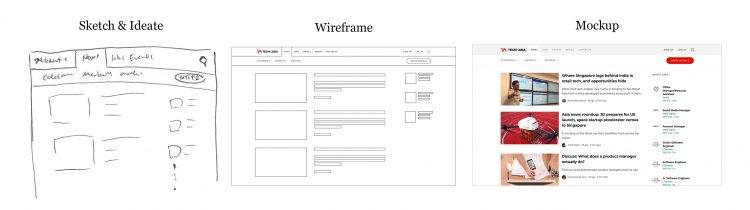
Validating
We ran multiple rounds of usability tests with different permutations of user flows between products. After many iterations, we were able to confidently validate our solutions for the problems we set out to solve.
During the validation process, we learned that by restructuring the navigation, it eliminated unnecessary items from the navigation bar, providing a distraction-free environment for users to complete their tasks more efficiently.
Challenges
By essentially recreating all our assets – from our web apps to our mobile clients – we faced numerous design, product, and engineering challenges. What do our users really need? Could we realistically implement design solutions that cater to those needs?
Because our products have scaled up significantly, we decided to move our entire frontend to TypeScript, a statically typed variant of JavaScript that has greatly improved developer productivity and iteration speed.
We’ve also whittled down product and decision-making processes, digging deep into all available data to avoid wasting resources as we embarked on our somewhat Herculean task.
A True Community
We’ve taken great pains and put extra emphasis on this overarching goal of community. Media, jobs, and events now blend seamlessly together across our various apps, and we’ve seen to it that moving between each segment is as frictionless as possible.
We’ve also launched a custom-built community editor, which should not only boost community participation but also make it a pleasure for members to share their knowledge and expertise.
Looking Forward
While it’s been a grueling time for our product squad, rest assured that we’re not going to stop here.
Our redesign was not designed to be perfect, but to be perfected. During our research, we have identified flaws and more friction points in our products that we’re excited to tackle after this release. We hope you’ll be on this journey with us and let us how we can serve you better.
Our refreshed mobile apps are now available:


Stay updated on the go with our mobile app.
Get latest insights with smoother, more personalized experience through TIA mobile app.
Recommended reads
 The business ideas in your head are getting easier to build
 The 2026 Prediction Bingo update: half right, fully accountable
 Ex-AWS exec launches startup to power enterprise systems with AI
 Singapore AI startup obtains $5m in Square Peg-led seed round
 Could the future of tech be found in an art museum?
 Reka AI launches multimodal language model to rival Google’s Gemini
 Temasek-backed PsiQuantum to build first commercial quantum computer
 The never-ending race: Why product innovation is crucial in 2024
 Energy is infectious, so pick your tribe
 IBM on AGI: bad math, wrong science





Editing by Eileen C. Ang
(And yes, we’re serious about ethics and transparency. More information here.)



📅 Upcoming Events
22 October 2026
Payoneer x CSPN Summit 2026