Stuart Hall
At Appbot we get to see a lot of app icons while providing insights into app reviews.
In the past I have studied everything from app descriptions, to screenshots, to names, to countries. The one that has always really interested me most was app icons, but I never came up with an idea on how to really study what is effective.
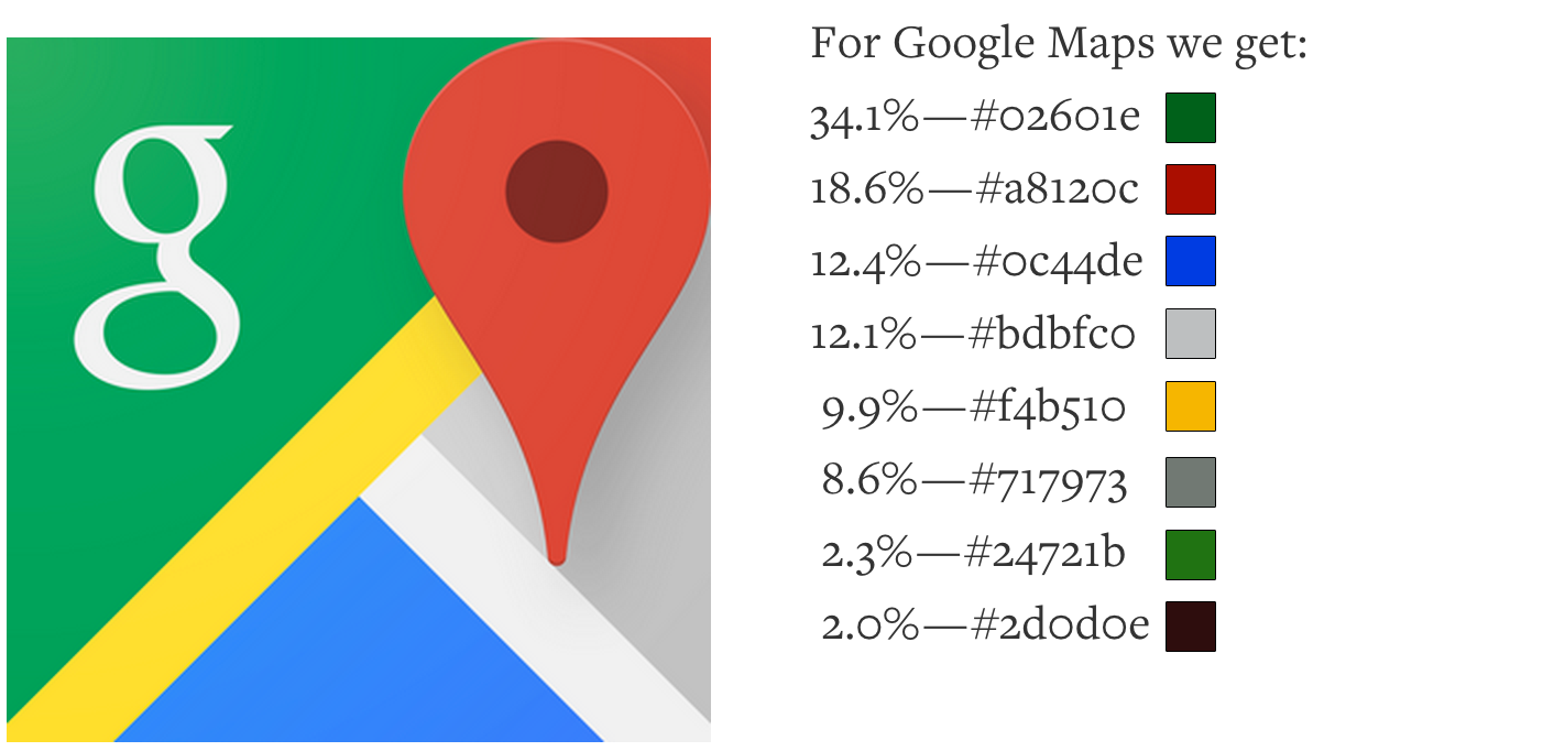
Recently I stumbled across a cool Ruby library called Miro that extracts the dominant colors from an image.
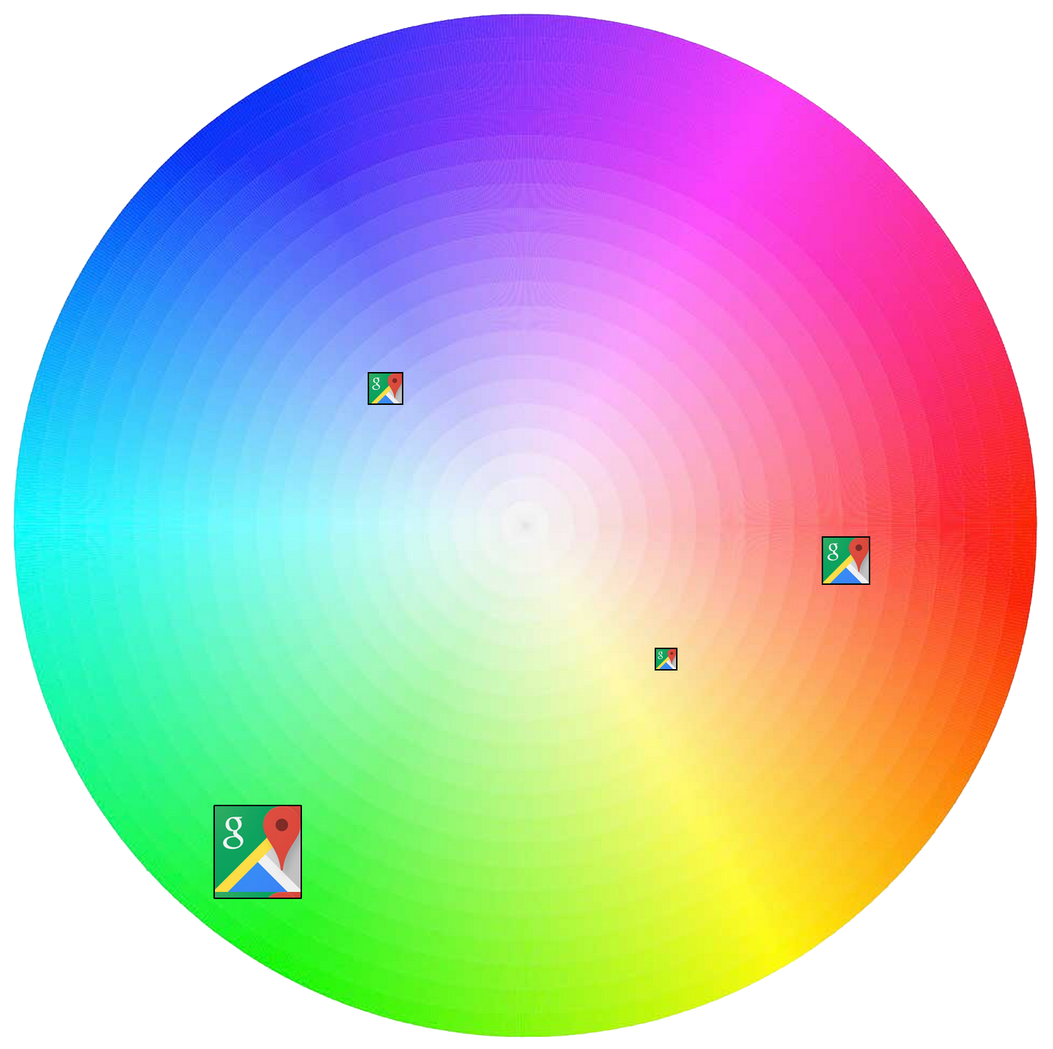
Finding the dominant colors of apps shows some really interesting results.