- Insights This article was written by a TIA community member. Insights pieces undergo the same rigorous editorial process that newsroom-produced articles have.
 Yu Siang Teo · · 10 min read
Material Design and the mystery meat navigation problem
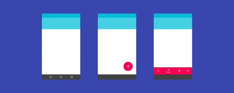
In March 2016, Google updated Material Design to add bottom navigation bars to its UI library. This new bar contains three to five icons that allow users to navigate between top-level views in an app.
Sounds familiar? That’s because the bottom navigation bars have been a part of iOS’ UI library for years, and they’re called tab bars.

Bottom navigation bars are a better alternative to the hamburger menu, so their addition to Material Design should be good news. But Google’s version has a serious problem: mystery meat navigation.
Whether you’re an Android user, designer, or developer, this should trouble you.
What’s mystery meat navigation, and why’s it so bad?
Mystery meat navigation is a term coined in 1998 by Vincent Flanders, the creator of the famous website Web Pages That Suck. It refers to buttons or links that don’t explain what they do in itself; you have to click on them to find out. (The term “mystery meat” originates from the meat served in American public school cafeterias that were processed to the point where its origin can no longer be recognized.)

Mystery meat navigation is the hallmark of designs that prioritize form over function. It’s bad UX design because it emphasizes aesthetics at the cost of user experience. It adds cognitive load to navigational tasks since users have to guess what the button does. And if your users need to guess, you’re doing it wrong.
You wouldn’t want to eat mystery meat and, similarly, users wouldn’t want to click on mystery buttons.
Strike 1: Android Lollipop’s navigation bar
Material Design’s first major mystery meat navigation problem happened in 2014 with Android Lollipop.
Android Lollipop was introduced in the same conference where Material Design debuted and sported a redesigned UI to match Google’s new design language.
Strike 2: Floating action buttons
Strike 3: The new bottom navigation bar
Material Design and form over function





Stay updated on the go with our mobile app.
Get latest insights with smoother, more personalized experience through TIA mobile app.








📅 Upcoming Events
22 October 2026
Payoneer x CSPN Summit 2026