- Insights This article was written by a TIA community member. Insights pieces undergo the same rigorous editorial process that newsroom-produced articles have.
 Hayk Yaghubyan · · 5 min read
Things we learned making our website mobile-optimized
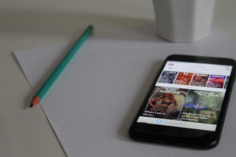
Photo credit: Anton.
According to GlobalWebIndex, the smartphone is the most important device for accessing the internet. But a lot of websites still don’t seem to be mobile-responsive.
A mobile-responsive website attracts more users, improves engagement, increases conversion rates, and boosts your Google ranking. But there has been a huge panic in the SEO industry because of Google’s mobile-first indexing. Google uses a bot to crawl websites as a desktop user would to add pages to its index. However, after launching mobile-first indexing, Google will crawl websites like a mobile user. This is because users are now searching more on mobile than on desktop, according to the search giant.
In this article, I will share the things my team and I learned in the following areas as we make our website mobile-optimized:
- The fundamentals of responsive design
- The role of a web page’s loading speed for mobile SEO
- Mobile user experience
Responsive design
First, you need to test your site to see how it performs on mobile and find out the issues that you need to solve. Google provides an amazing tool that can give you detailed information about your site’s mobile optimization. Just enter your website URL and click Test Now to get started.

Here are the test results for our website. As you see, it scored perfectly, which is great.

But how did we get this result? Luckily, we built our site on WordPress and picked a theme that’s already mobile-responsive.
But what should you do if you’re already on WordPress but your website isn’t still responsive? There are two ways to solve this problem: either make changes on your site’s scripts or install plugins that will do the job for you. Here are two plugins you can use:
Page speed
Mobile user experience





Stay updated on the go with our mobile app.
Get latest insights with smoother, more personalized experience through TIA mobile app.