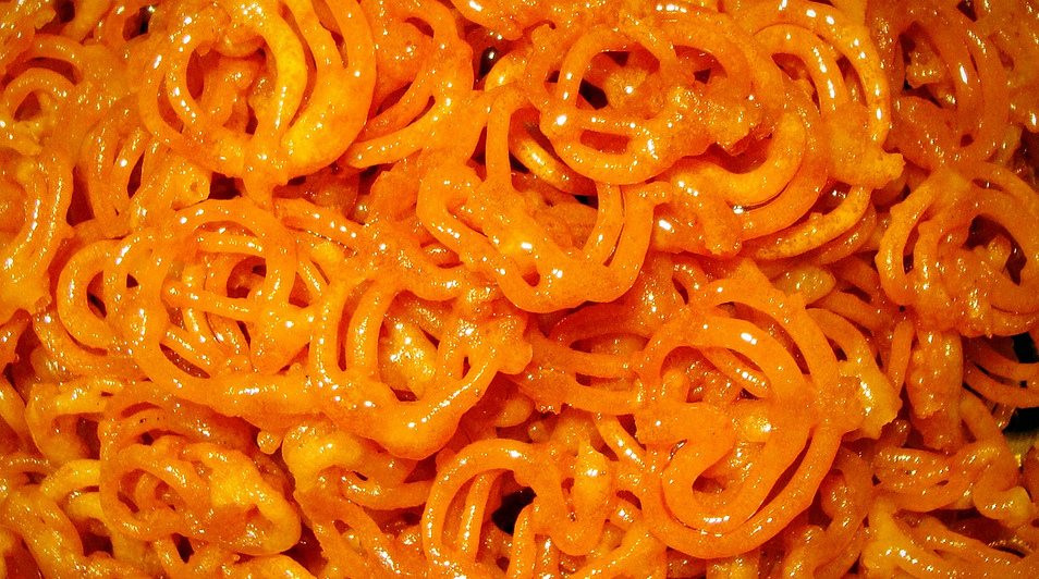
Photo credit: Soumyadeep Paul.
Who doesn’t know what a Jalebi is? It has a round and luscious pattern, dripping with appetizing sugar, and keeps us dreaming about it. It’s a dessert that no one can say no to.
While it may seem peculiar to hear design and Jalebi in the same phrase, it will get clear soon that creating a design is just as grueling, and just as interesting as making—or in our case, eating—a Jalebi.
A designs structure is just as complicated as a Jalebi’s structure, there are no common patterns and straight jacketed molds for either. They both flow in whichever way we want them to, wherever our creativity leads us.
So here are the nine key ingredients that will make your designs infinitely better.
Alignments
It’s not only about look and feel, but how your potential users interact with the product. So, while you think there’s no feature about your design that’s amiss, you have to check, and then check again if anything needs to be refurbished.
More often than not, alignment is something that is overlooked. But these small aspects are something that can make or break your Design, and that’s the reason you have to keep them on point.
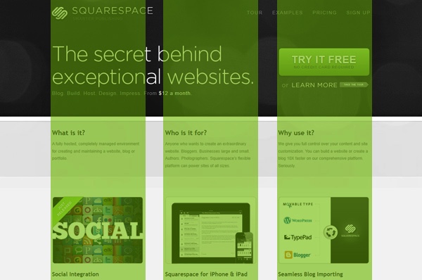
Typography (fonts)
When something is designed to work beautifully, it tends to look that way too. That is the reason you have to spend a good amount of time figuring out the font that will work well for your product. The content not only has to be good, but readable too and, believe me, it will take good skills to come up with a meaningful reading experience. To do this right, you need to make a reading and visual typo hierarchy.

A good example visual typo hierarchy in the above graphic (Source: SuperDry)
Usage of colors
Contrast and colors are subjective, what we like won’t necessary appeal to the next person. Giving suggestions to make changes in color patterns might not seem fair, but there is no denying that colors make apps more lively, adds pizzazz, and vibrancy too. Minimalistic color designs always seem to work out well for some, but this depends on the design vertical you depend on.
For example, if you are working on a project that is meant for kids, use colors that will appeal to them. For a fashion brand like Super Dry, use colors that are in contrast or that represents the color patterns of the brand, as it will resonate the brand more.
Be simple and cut the clutter
A clear focal point
Consistency is key
Don’t forget the goal
Balance the features
Meaningful animations





Stay updated on the go with our mobile app.
Get latest insights with smoother, more personalized experience through TIA mobile app.