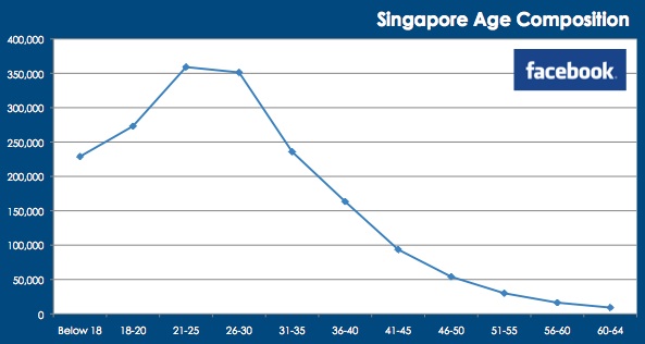
Facebook’s ad data can not only tell you how Facebook-ish a country is, it can tell you its Facebook demographics.
But what’s the big deal?
Well, as a marketer, it is essential to understand your market’s Facebook demographics before using it as a promotion platform. Promoting a product to the wrong target group is the last thing you need.
With that said, below are steps on how you can use Facebook data and Excel to create a nice demographics chart. It’s no rocket science; you just need 2 steps.
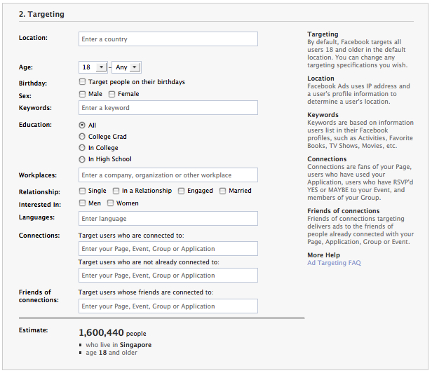
1. Collect Data
What data do you need? Facebook doesn’t just classify its users via ‘country’ and ‘age’, it can also filter the population by ‘education’, ‘language’, ‘relationship’ and more. Collect only relevant data that can help you solve your marketing problem.
2. Create the graph
I trust that you know how to create a graph on your own. Below are the age composition of Facebook users in Singapore and U.S. I basically labeled the axes and plugged the numbers into an excel sheet. Repeat the steps for other age groups.
An example (View the excel sheet here):
x-axis: Age group
y-axis: No. of people





Stay updated on the go with our mobile app.
Get latest insights with smoother, more personalized experience through TIA mobile app.












📅 Upcoming Events
22 October 2026
Payoneer x CSPN Summit 2026